MART.io
Date: 2023-05-08
For this project, we were tasked with finding and synthesizing data in order to mine patterns and build a model. We chose to use MARTA data, due to its importance to Atlanta and the availability of data via its API. We also used traffic data from the Google Maps API and weather data from a weather API. The traffic data was mainly used as a proxy for MARTA ridership data, as they do not provide that, and we figured that MARTA would be busy at the same times the highways are busy (rush hour, etc).
The first step was to collect all the data. We had 3 functions to get the data from the API and into a data frame.
Once we had these functions, we had to collect data. We wanted to pull data every 10 minutes in order to ensure we had enough
for the modeling. This was done using a desktop computer, the BlockingScheduler function, the KeepingMeAwake app.
This function ran for 47 days, giving us several hundred-thousand rows of data. Below is an example of the code, with
rail() being the function for reading in the API data. This function outputs a csv file every 6 hours, which was a good way to
mitigate the risk of the computer crashing and losing data.
def some_job2():
lists.append(rail())
if len(lists) % 36 == 0:
df_marta = pd.DataFrame()
for i in range(len(lists)):
df_marta = pd.concat([df_marta, lists[i]],ignore_index=True,axis=0)
now = datetime.now()
df_marta.to_csv(f'~/Documents/Grad School/Spring 23/ISyE 7406/MARTA/{now}marta.csv')
lists.clear()
print('done')
scheduler = BlockingScheduler()
scheduler.add_job(some_job2, 'interval', minutes=10) #the time value can be changed to run the function more/less often
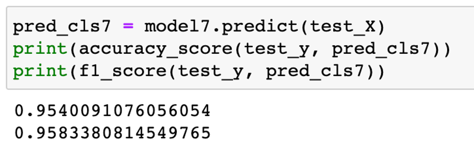
scheduler.start()After the data was collected, it was combined and cleaned. We were looking to predict delays, but quickly found that it was difficult to accurately predict the exact delay. We switched to a classification model, predicting if the train is delayed or not, with much more success. We lagged the response variable delay by 7 days, as an effort to predict 7 days in advance. The results of the model were very impressive, as seen below.
We tried this approach with lags of 1-6 days, but did not find similar success, so we stuck with just the 7 day model.
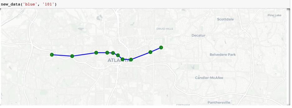
Once we had our predictions generated, it was time for a visual map. We used the folium package in python to accomplish this.
The map was color coded by line, with each station appearing green or red depending on the presence of a delay.
The map was generated inside a function, which received input values for line color and train ID.
Then it pulled data instantaneously, cleaned it, generated predictions, and then the map with the results of the predictions.
An example of the output is shown below:
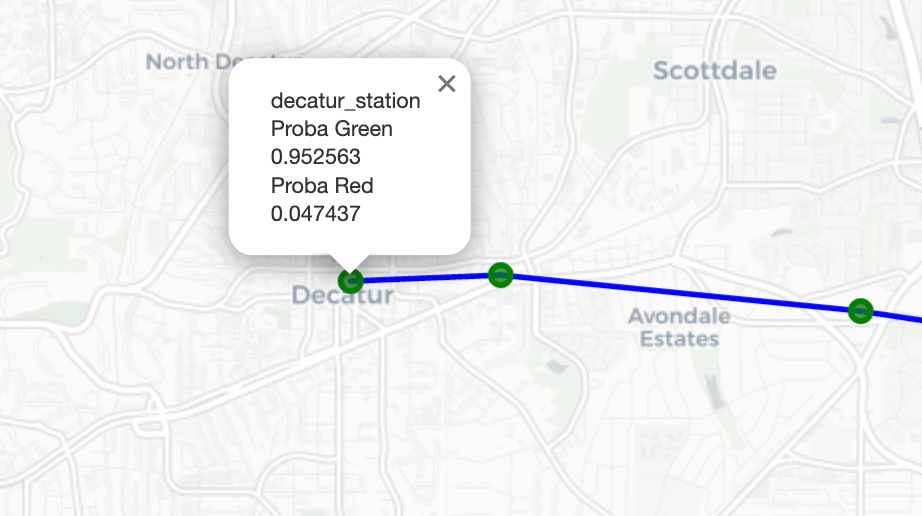
We also had a tooltip which displayed the exact probability of the delay occurring, as well as the station name.
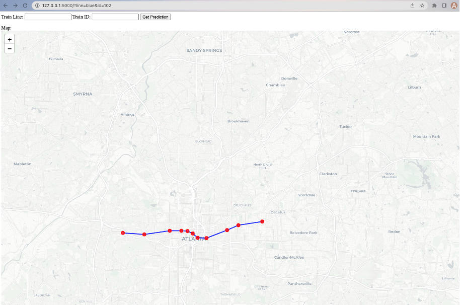
We wanted to run the function on a web server to allow others to access, but issues with the MARTA API prevented us from accomplishing this. We were, however, successfully able to run a Flask server locally, which allowed the user to input values and return a map. A look at how the server appears is below.
Overall, we were very satisfied with the outcomes of the project. While we wish we had a working web server, issues beyond our control prevented this. The entirety of the code can be found at https://github.com/an-crawford/mart.io.